- Creating an Application
- Working with Components
- Lists
- The Java Class Library
- Summary
- Q and A
- Quiz
- Certification Practice
- Exercises
This chapter is from the book
This chapter is from the book
This chapter is from the book
Working with Components
Swing offers more than two dozen user interface components in addition to the buttons and containers you have used so far. You will work with many of these components throughout the rest of this lesson and further in Lesson 10, “Building an Interface.”
All Swing components inherit several useful methods from their common superclass, JComponent.
The setEnabled(boolean) method determines whether a component can receive user input (the argument true) or is inactive and cannot receive input (false). Components are enabled by default. Many components change in appearance to indicate whether they are presently usable. For instance, a disabled JButton has light gray borders and gray text. If you want to check whether a component is enabled, you can call the isEnabled() method, which returns a boolean value.
The setVisible(boolean) method works for all components the way it does for containers. Use true to display a component and false to hide it. There also is a boolean isVisible() method.
The setSize(int, int) method resizes the component to the width and height specified as arguments, and setSize(Dimension) uses a Dimension object to accomplish the same thing. For most components, you don’t need to set a size; the default is usually acceptable. To find out a component’s size, call its getSize() method, which returns a Dimension object with the dimensions in height and width instance variables.
As you will see, similar Swing components have other methods in common inherited from superclasses, such as setText() and getText() for text components and setValue() and getValue() for components that store numeric values.
Image Icons
Swing supports the use of graphical ImageIcon objects on buttons and other components in which a label can be provided. An icon is a small graphic that can be placed on a button, a label, or another user interface element to identify it. Examples include a garbage can or recycling bin icon for deleting files and folder icons for opening and storing files.
You can create an ImageIcon object by specifying the filename of a graphic as the only argument to the constructor. The following example loads an icon from the graphics file subscribe.gif and creates a JButton with the icon as its label:
ImageIcon subscribe = new ImageIcon("subscribe.gif");
JButton button = new JButton(subscribe);
JPanel pane = new JPanel();
pane.add(button);
add(pane);
setVisible(true);
Listing 9.3 is a Java application that creates four image icons with text labels, adds them to a panel, and then adds the panel to a frame. Create a new empty Java file in NetBeans for a class named IconFrame in the package com.java21days and enter this listing with the source code editor.
LISTING 9.3 The Full Text of IconFrame.java
 1: package com.java21days;
 2:
 3: import javax.swing.*;
 4:
 5: public class IconFrame extends JFrame {
 6:     JButton load, save, subscribe, unsubscribe;
 7:
 8:     public IconFrame() {
 9:         super("Icon Frame");
10:         setDefaultCloseOperation(JFrame.EXIT_ON_CLOSE);
11:         JPanel panel = new JPanel();
12:         // create icons
13:         ImageIcon loadIcon = new ImageIcon("load.gif");
14:         ImageIcon saveIcon = new ImageIcon("save.gif");
15:         ImageIcon subscribeIcon = new ImageIcon("subscribe.gif");
16:         ImageIcon unsubscribeIcon = new ImageIcon("unsubscribe.gif");
17:         // create buttons
18:         load = new JButton("Load", loadIcon);
19:         save = new JButton("Save", saveIcon);
20:         subscribe = new JButton("Subscribe", subscribeIcon);
21:         unsubscribe = new JButton("Unsubscribe", unsubscribeIcon);
22:         // add buttons to panel
23:         panel.add(load);
24:         panel.add(save);
25:         panel.add(subscribe);
26:         panel.add(unsubscribe);
27:         // add the panel to a frame
28:         add(panel);
29:         pack();
30:         setVisible(true);
31:     }
32:
33:     public static void main(String[] arguments) {
34:         IconFrame ike = new IconFrame();
35:     }
36: }
Figure 9.3 shows the result.
)
FIGURE 9.3 An interface containing buttons labeled with icons.
The icons’ graphics referred to in lines 13–16 can be found on this book’s official website, at www.java21days.com, on the Lesson 9 page.
In NetBeans, the graphics must be part of the project in order for this application to run correctly. The graphics need to be stored in the main folder of the Java21 project you’ve been using throughout this book to hold the classes you create. Follow these steps:
Save the graphics files to a temporary folder on your computer.
Click the Files tab to bring that pane to the front. The Files pane opens, as shown in Figure 9.4, listing the files in the project.
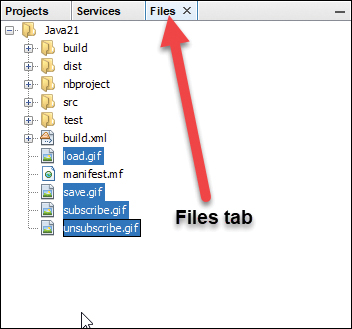
FIGURE 9.4 Dragging files into the NetBeans Files pane.
Drag and drop the four graphics files into the Java21 folder in this pane.
The IconFrame application does not set the size of the frame in pixels. Instead, the pack() method is called in line 29 to expand the frame to the minimum size required to present the four buttons next to each other.
If the frame were set to be tall rather than wide—for instance, by calling setSize(100, 400) in the constructor—the buttons would be stacked vertically.
Labels
A label is a component that holds text, an icon, or both. Labels, which are created from the JLabel class, identify the purposes of other components on an interface. A user cannot edit them directly.
To create a label, you can use these simple constructors:
JLabel(String): A label with the specified text
JLabel(String, int): A label with the specified text and alignment
JLabel(String, Icon, int): A label with the specified text, icon, and alignment
A label’s alignment determines how its text or icon is aligned in relation to the area taken up by the window. Three static class variables of the SwingConstants interface are used to specify alignment: LEFT, CENTER, and RIGHT.
You can set a label’s contents with the setText(String) or setIcon(Icon) methods. You also can retrieve these things with the getText() and getIcon() methods.
The following statements create three labels with left, center, and right alignment, respectively:
JLabel feedsLabel = new JLabel("Feeds: ", SwingConstants.LEFT);
JLabel urlLabel = new JLabel("URL: ", SwingConstants.CENTER);
JLabel dateLabel = new JLabel("Date: ", SwingConstants.RIGHT);
Text Fields
A text field is a location on an interface where a user can enter and modify text using the keyboard. Text fields are represented by the JTextField class, and each can handle one line of input. The next section describes a text area component that can handle multiple lines.
Constructors for text fields include the following:
JTextField(): An empty text field
JTextField(int): A text field with the specified width
JTextField(String, int): A text field with the specified text and width
A text field’s width attribute has relevance only if the interface is organized in a manner that does not resize components. You’ll get more experience with this when you work with layout managers in Lesson 11, “Arranging Components on a User Interface.”
The following statements create an empty text field that has enough space for roughly 60 characters and a text field of the same size with the starting text “Enter feed URL here”:
JTextField rssUrl = new JTextField(60);
JTextField rssUrl2 = new JTextField("Enter feed URL here", 60);
Text fields and text areas both inherit from the superclass JTextComponent, and they share many common methods.
The setEditable(boolean) method determines whether a text component can be edited (true) or not (false). An isEditable() method returns a corresponding boolean value.
The setText(String) method changes the text to the specified string, and the getText() method returns the component’s current text as a string. Another method retrieves only the text that a user has highlighted in the getSelectedText() component.
Password fields are text fields that hide the characters a user types into the field. They are represented by the JPasswordField class, a subclass of JTextField. The JPasswordField constructors take the same arguments as those of the parent class.
After you have created a password field, call its setEchoChar(char) method to obscure input by replacing each input character with the specified character.
The following statements create a password field and set its echo character to #:
JPasswordField codePhrase = new JPasswordField(20);
codePhrase.setEchoChar('#');
Text Areas
Text areas, editable text fields that can handle more than one line of input, are implemented by the JTextArea class. It has these constructors:
JTextArea(int, int): A text area with the specified number of rows and columns
JTextArea(String, int, int): A text area with the specified text, rows, and columns
You can use the getText(), getSelectedText(), and setText(String) methods with text areas as you would text fields. Also, an append(String) method adds the specified text at the end of the current text, and an insert(String, int) method inserts the specified text at the indicated position.
The setLineWrap(boolean) method determines whether text entered into the component will wrap to the next line when it reaches the right edge. Call setLineWrap(true) to cause line wrapping to occur.
The setWrapStyleWord(boolean) method determines what wraps to the next line—either the current word (true) or the current character (false).
The next project you’ll create, the Authenticator application shown in Listing 9.4, uses several Swing components to collect user input: a text field, a password field, and a text area. Labels also are used to indicate the purpose of each text component. In NetBeans, create an empty Java file called Authenticator in the package com.java21days.
LISTING 9.4 The Full Text of Authenticator.java
 1: package com.java21days;
 2:
 3: import javax.swing.*;
 4:
 5: public class Authenticator extends javax.swing.JFrame {
 6:     JTextField username = new JTextField(15);
 7:     JPasswordField password = new JPasswordField(15);
 8:     JTextArea comments = new JTextArea(4, 15);
 9:     JButton ok = new JButton("OK");
10:     JButton cancel = new JButton("Cancel");
11:
12:     public Authenticator() {
13:         super("Account Information");
14:         setSize(300, 220);
15:         setDefaultCloseOperation(JFrame.EXIT_ON_CLOSE);
16:
17:         JPanel pane = new JPanel();
18:         JLabel usernameLabel = new JLabel("Username: ");
19:         JLabel passwordLabel = new JLabel("Password: ");
20:         JLabel commentsLabel = new JLabel("Comments: ");
21:         comments.setLineWrap(true);
22:         comments.setWrapStyleWord(true);
23:         pane.add(usernameLabel);
24:         pane.add(username);
25:         pane.add(passwordLabel);
26:         pane.add(password);
27:         pane.add(commentsLabel);
28:         pane.add(comments);
29:         pane.add(ok);
30:         pane.add(cancel);
31:         add(pane);
32:         setVisible(true);
33:     }
34:
35:     private static void setLookAndFeel() {
36:         try {
37:             UIManager.setLookAndFeel(
38:                 "javax.swing.plaf.nimbus.NimbusLookAndFeel"
39:             );
40:         } catch (Exception exc) {
41:             System.out.println(exc.getMessage());
42:         }
43:     }
44:
45:     public static void main(String[] arguments) {
46:         Authenticator.setLookAndFeel();
47:         Authenticator auth = new Authenticator();
48:     }
49: }
This application sets up components and adds them to a panel in lines 17–30. Figure 9.5 shows the application in use. The password is obscured with asterisk characters (*), which is the default when no other echo character is designated through a call to the field’s setEchoChar(char) method.
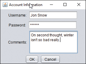
FIGURE 9.5 The Authenticator application.
The text area in this application behaves in a manner that you might not expect. When you reach the bottom of the field and continue entering text, the component grows to make more room for input (and even scrolls below the bottom edge of the frame). The next section describes how to add scrollbars to prevent the area from changing in size.
Scrolling Panes
Text areas in Swing do not include horizontal or vertical scrollbars, and there’s no way to add them using this component alone.
Swing supports scrollbars through a container that can be used to hold any component that can be scrolled: JScrollPane.
A scrolling pane is associated with a component in the pane’s constructor. You can use the following constructors:
JScrollPane(Component): A scrolling pane that contains the specified component
JScrollPane(Component, int, int): A scrolling pane with the specified component, vertical scrollbar configuration, and horizontal scrollbar configuration
Scrollbars are configured using one of six static class variables of the ScrollPaneConstants interface. There are three for vertical scrollbars:
VERTICAL_SCROLLBAR_ALWAYS
VERTICAL_SCROLLBAR_AS_NEEDED
VERTICAL_SCROLLBAR_NEVER
There also are three variables for horizontal scrollbars with the names you’d expect.
After you create a scrolling pane containing a component, you can add the pane to containers in place of that component.
The following example creates a text area with a vertical scrollbar and no horizontal scrollbar and then adds it to a container:
JPanel pane = new JPanel();
JTextArea comments = new JTextArea(4, 15);
JScrollPane scroll = new JScrollPane(comments,
    ScrollPaneConstants.VERTICAL_SCROLLBAR_ALWAYS,
    ScrollPaneConstants.HORIZONTAL_SCROLLBAR_NEVER);
pane.add(scroll);
add(pane);
Check Boxes and Radio Buttons
Check boxes and radio buttons hold only two possible values: selected or not selected.
Check boxes are used to make simple choices in an interface, such as yes/no or on/off. Radio buttons are grouped so that only one button can be selected at any time.
Check boxes (the JCheckBox class) appear as labeled or unlabeled boxes that contain a check mark when they are selected and nothing otherwise. Radio buttons (the JRadioButton class) appear as circles that contain a dot when selected and nothing otherwise.
Both the JCheckBox and JRadioButton classes have several useful methods inherited from JToggleButton, their common superclass:
setSelected(boolean): Selects the component if the argument is true and deselects it otherwise
isSelected(): Returns a Boolean indicating whether the component is currently selected
The following constructors can be used for the JCheckBox class:
JCheckBox(String): A check box with the specified text label
JCheckBox(String, boolean): A check box with the specified text label that is selected if the second argument is true
JCheckBox(Icon): A check box with the specified graphical icon
JCheckBox(Icon, boolean): A check box with the specified graphical icon that is selected if the second argument is true
JCheckBox(String, Icon): A check box with the specified text label and graphical icon
JCheckBox(String, Icon, boolean): A check box with the specified text label and graphical icon that is selected if the third argument is true
The JRadioButton class has constructors with the same arguments and functionality.
Check boxes and radio buttons by themselves are nonexclusive, meaning that if you have five check boxes in a container, all five can be checked or unchecked at the same time. To make them exclusive, as radio buttons should be, you must organize related components into groups.
To organize several radio buttons into a group, allowing only one to be selected at a time, create a ButtonGroup class object, as demonstrated in the following statement:
ButtonGroup choice = new ButtonGroup();
The ButtonGroup object keeps track of all radio buttons in its group. Call the group’s add(Component) method to add the specified component to the group.
The following example creates a group and two radio buttons that belong to it:
ButtonGroup saveFormat = new ButtonGroup();
JRadioButton s1 = new JRadioButton("JSON", false);
saveFormat.add(s1);
JRadioButton s2 = new JRadioButton("XML", true);
saveFormat.add(s2);
The saveFormat object groups the s1 and s2 radio buttons. The s2 object, which has the label "XML", is selected. Only one member of the group can be selected at a time. If one component is selected, the ButtonGroup object ensures that all others in the group are deselected.
Create a new empty Java file in NetBeans called FormatFrame in the package com.java21days. Enter the source code shown in Listing 9.5 to create an application with four radio buttons in a group.
LISTING 9.5 The Full Text of FormatFrame.java
 1: package com.java21days;
 2:
 3: import javax.swing.*;
 4:
 5: public class FormatFrame extends JFrame {
 6:     JRadioButton[] teams = new JRadioButton[4];
 7:
 8:     public FormatFrame() {
 9:         super("Choose an Output Format");
10:         setSize(320, 120);
11:         setDefaultCloseOperation(JFrame.EXIT_ON_CLOSE);
12:         teams[0] = new JRadioButton("Atom");
13:         teams[1] = new JRadioButton("RSS 0.92");
14:         teams[2] = new JRadioButton("RSS 1.0");
15:         teams[3] = new JRadioButton("RSS 2.0", true);
16:         JPanel panel = new JPanel();
17:         JLabel chooseLabel = new JLabel(
18:             "Choose an output format for syndicated news items.");
19:         panel.add(chooseLabel);
20:         ButtonGroup group = new ButtonGroup();
21:         for (JRadioButton team : teams) {
22:             group.add(team);
23:             panel.add(team);
24:         }
25:         add(panel);
26:         setVisible(true);
27:     }
28:
29:     private static void setLookAndFeel() {
30:         try {
31:             UIManager.setLookAndFeel(
32:                 "com.sun.java.swing.plaf.nimbus.NimbusLookAndFeel"
33:             );
34:         } catch (Exception exc) {
35:             System.out.println(exc.getMessage());
36:         }
37:     }
38:
39:     public static void main(String[] arguments) {
40:         FormatFrame.setLookAndFeel();
41:         FormatFrame ff = new FormatFrame();
42:     }
43: }
Figure 9.6 shows the application running. The four JRadioButton objects are stored in an array in lines 12–15. In the for loop in lines 21–24, each element is first added to a button group and then is added to a panel. After the loop ends, the panel is added to the frame.
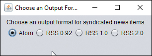
FIGURE 9.6 The FormatFrame application.
Choosing one of the radio buttons causes the existing choice to be deselected.
Combo Boxes
The Swing class JComboBox can be used to create combo boxes, components that present a drop-down menu from which a single value can be selected. The menu is hidden when the component is not being used, thus taking up less space in a GUI.
After a combo box is created by calling the JComboBox() constructor with no arguments, the combo box’s addItem(Object) method adds items to the list.
Another way to create a combo box is to call JComboBox(Object[]) with an array that contains the items. If the items are text, a String array would be the argument.
In a combo box, users can select only one of the items on the drop-down menu. If the component’s setEditable() method is called with true as an argument, it also supports text entry. This feature gives combo boxes their name: A component configured in this manner serves as both a drop-down menu and a text field.
The JComboBox class has several methods you can use to control a drop-down list or combo box:
getItemAt(int): Returns the text of the list item at the index position specified by the integer argument. As with arrays, the first item of a choice list is at index position 0, the second is at position 1, and so on.
getItemCount(): Returns the number of items in the list.
getSelectedIndex(): Returns the index position of the currently selected item in the list.
getSelectedItem(): Returns the text of the currently selected item.
setSelectedIndex(int): Selects the item at the indicated index position.
setSelectedIndex(Object): Selects the specified object in the list.
The FormatFrame2 application, shown in Listing 9.6, rewrites the preceding radio button example. The program uses a noneditable combo box from which a user can choose one of four options.
LISTING 9.6 The Full Text of FormatFrame2.java
 1: package com.java21days;
 2:
 3: import javax.swing.*;
 4:
 5: public class FormatFrame2 extends JFrame {
 6:     String[] formats = { "Atom", "RSS 0.92", "RSS 1.0", "RSS 2.0" };
 7:     JComboBox<String> formatBox = new JComboBox<>(formats);
 8:
 9:     public FormatFrame2() {
10:         super("Choose a Format");
11:         setSize(220, 150);
12:         setDefaultCloseOperation(JFrame.EXIT_ON_CLOSE);
13:         JPanel pane = new JPanel();
14:         JLabel formatLabel = new JLabel("Output formats:");
15:         pane.add(formatLabel);
16:         pane.add(formatBox);
17:         add(pane);
18:         setVisible(true);
19:     }
20:
21:     private static void setLookAndFeel() {
22:         try {
23:             UIManager.setLookAndFeel(
24:                 "com.sun.java.swing.plaf.nimbus.NimbusLookAndFeel"
25:             );
26:         } catch (Exception exc) {
27:             System.out.println(exc.getMessage());
28:         }
29:     }
30:
31:     public static void main(String[] arguments) {
32:         FormatFrame2.setLookAndFeel();
33:         FormatFrame2 ff = new FormatFrame2();
34:     }
35: }
A string array is defined in line 6, and then these strings are used in the combo box constructor in line 7 to set its possible values. The JComboBox constructor uses generics to indicate that its values are strings. Figure 9.7 shows the application as the combo box is expanded so that a value can be selected.
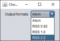
FIGURE 9.7 The FormatFrame2 application.
)
)
)
)