
This chapter is from the book
This chapter is from the book
This chapter is from the book
9.8 Positioning
In this section, we are going to take a look at how positioning works in CSS, focusing on the site logo, and then we’ll finish off the header design. CSS positioning can be a little tricky, and honestly there are people who work with CSS all the time who regularly get confused trying to get positioning to work right. So if this section seems long and loaded with examples, just bear with us and work through it all—you’ll find that understanding CSS positioning is an essential skill.
When you style an element’s position, there are two basic possibilities:
Have the browser draw the element in its natural position in the normal flow of content on the page.
Remove the target from the flow of content and display it in a different place using directional styles—left, right, top, and bottom—and an additional dimension, the so-called z-index.
When an element is moved around out of its natural position with directional styles, it doesn’t affect other elements in the document—it either covers them up or is hidden behind them. It becomes like a ship cast adrift, torn free from its mooring on the page.
While it might be self-explanatory to move something left or right, or to change its top or bottom position, you might not be familiar with the idea of a z-index. The z-index property (usually a nonnegative number, 0 by default—negatives put elements behind everything) determines whether an element is displayed above or below other elements, as in farther “into” the screen or farther “out” toward the viewer. It’s an element’s 3D position.
You can think of this like looking down at a big stack of papers—the higher the z-index number is, the higher up the stack toward you the element is. A z-index of 0 would be the bottommost piece of paper. We’ll see a concrete example of the z-index in Section 9.9.
In order to change those directional styles, we first need to alter an element’s position property. The position style in CSS can be given five different values (though one of them isn’t really used). We’ll start with one of the most common one, static.
position: static (Figure 9.25)
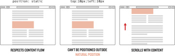
Figure 9.25: How position: static affects elements.
– This is the default positioning of elements in the flow of content.
– An element that has no position style set, or has position: static, will ignore directional styles like left, right, top, and bottom.
position: absolute (Figure 9.26)
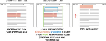
Figure 9.26: How position: absolute affects elements.
– Positions the element at a specific place by taking it out of the document flow, either within a parent wrapper that has a position: value other than static, or (if there is no parent) a specific place in the browser window. It is still a part of the page content, which means when you scroll the page, it moves with the content.
– Also lets you define a z-index property.
– Because the element is removed from the document flow, the width or height is determined either by shrinking to the content inside or by setting dimensions in CSS. It behaves kind of like an element set to inline-block.
– Causes any float that is set on the object to be ignored, so if you have both styles on an element you might as well delete the float.
position: relative (Figure 9.27)
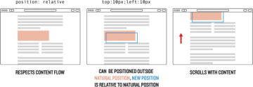
Figure 9.27: How position: relative affects elements.
– This is like static in that it respects the element’s starting position in the flow of content, but it also allows directional styles to be applied that nudge the element away from the boundary with other elements.
– It allows absolutely positioned items to be contained within, as though the relatively positioned element were a separate canvas. In other words, if an absolutely positioned element is inside a relatively positioned element, a style of top: 0 would cause the absolutely positioned element to be drawn at the top of the relatively positioned element rather than at the top of the page.
– Also allows you to change the z-index of the element.
position: fixed (Figure 9.28)
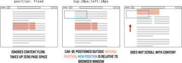
Figure 9.28: How position: fixed affects elements.
– Positions the element at a specific place within the browser window totally separate from the page content. When you scroll the page, it won’t move.
– Lets you set z-index.
– Has the same need to have dimensions set as position: absolute; otherwise, it will be the size of the content inside.
– Also causes floats to be ignored.
position: inherit
– This is not very common, so we aren’t going to discuss it other than to say it makes the element inherit the position from its parent.
)
)
)
)
Let’s play around with some examples. First, let’s add in some styles for the header to better see the boundaries and to give it dimensions (Listing 9.23).
Listing 9.23: Added styles for the .header class.
css/main.css
/* HEADER STYLES */
.header {
  background-color: #aaa;
  height: 300px;
  width: 100%;
}
Let’s now absolutely position the .header-logo and set it to 50px from the bottom (Listing 9.24).
Listing 9.24: Adding an initial position: absolute to the logo.
css/main.css
.header-nav > li:first-child a:hover {
  color: #fff;
}
.header-logo {
  bottom: 50px;
  position: absolute;
}
Now save and refresh… where did the logo go (Figure 9.29)?
)
Figure 9.29: The parent container has no position style set.
The logo link ended up way at the bottom because the parent element that wraps the .header-logo doesn’t have any position style applied. Also, if you scroll the page up and down you’ll notice that the .header-logo still moves with the page. Let’s constrain the logo to stay within the header by adding a position property, as shown in Listing 9.25.
Listing 9.25: Setting a position other than static on the wrapper.
css/main.css
.header {
  background-color: #aaa;
  height: 300px;
  position: relative;
  width: 100%;
}
With the position rule in Listing 9.25, the .header-logo will now be 50px from the bottom of the gray header box, and any positions that we give to .header-logo will be determined based on the boundaries of the .header container (Figure 9.30). The way that the position is based off of the boundaries of the parent is what we meant when we said that setting a parent wrapper to position: relative made it like a separate canvas—everything inside that is absolutely positioned takes its place based on the dimensions of the parent.
)
Figure 9.30: The absolutely positioned .header-logo.
Note here that when an element is absolutely positioned, the directional styles don’t add or subtract distance—setting bottom: 50px doesn’t move it toward the bottom, but rather sets the position 50px from the bottom. So right: 50px puts the element 50px from the right edge.
Negative positions work as well, and as long as the overflow of the parent wrapper isn’t set to hidden, the absolutely positioned element will get placed outside the boundaries of the parent (Listing 9.26).
Listing 9.26: Trying out negative positioning on our object.
css/main.css
.header-logo {
  bottom: -50px;
  position: absolute;
  right: 50px;
}
After adding that style and refreshing your browser, the logo should be in a position similar to what is shown in Figure 9.31.
)
Figure 9.31: Positioning the logo on the right-hand side.
You might be asking, “Well, what happens if I set both a top and bottom, or a left and right?” The answer is that, for whatever reasons, the top and left properties will take priority and the bottom and right will be ignored.
Another thing to consider is when you set a position property, you are manipulating elements and messing around with the natural page flow, which means that it is possible to cause misalignments. So if you add left: 200px to the .header, the width of the element (which is 100%) isn’t recalculated. Instead, the entire .header box is pushed over by 200px, and your browser window will have horizontal scrollbars and look broken (Figure 9.32).
)
Figure 9.32: This sort of thing looks sloppy.
You have to be careful!
While we are still just playing around in the positioning sandbox, we should take a look at ways to deal with a situation that comes up anytime positioning in CSS is discussed: How do you center an absolutely positioned object horizontally and vertically in a way that allows the object to be any size… and allows the wrapper to be any size?
Let’s first look at an old method where the object that we are centering has a set height and width—centering this is easy. Give the logo a width and height, remove the old positioning, and change the background to better see the object (Listing 9.27).
Listing 9.27: Adding height and width dimensions to the logo.
css/main.css
.header-logo {
  background-color: #000;
  height: 110px;
  position: absolute;
  width: 110px;
}
Now let’s center it.
You might think that centering the element would be as simple as giving the .header-logo class a style of left: 50% and top: 50%—that should put it in the middle, both horizontally and vertically, right (Listing 9.28)?
Listing 9.28: Positioning the .header-logo in the center?
css/main.css
.header-logo {
  background-color: #000;
  height: 110px;
  left: 50%;
  position: absolute;
  top: 50%;
  width: 110px;
}
Well, no, the reason this didn’t work is that when the browser positions an object, it calculates the distance using the same-named edge—so when you apply top: 50%, it moves the top edge (not the center point) of .header-logo 50% away from the top of .header; similarly, applying left: 50% tells the browser to move the left edge 50% away from the left of .header. The result is that the object we are trying to position is off-center by half of its width and height (Figure 9.33).
)
Figure 9.33: The red box in the expected position if centered vertically and horizontally.
How do we solve this and get our object in the actual center? The older method mentioned above was to use a negative margin (Section 8.6.2) to move the object up and left. This only works if you know the size of the object, though, since trying to use something like a percentage would move the object based on the size of the parent (recall from Section 7.4 that percentage values are based on the size of the parent object). Since the height and width of the box are 110px, half of that is 55px (Listing 9.29).
Listing 9.29: Adding in the negative margins to position the black box in the right spot.
css/main.css
.header-logo {
  background-color: #000;
  height: 110px;
  left: 50%;
  margin: -55px 0 0 -55px;
  position: absolute;
  top: 50%;
  width: 110px;
}
That works just fine, but you’d always be limiting yourself to centering only objects with fixed dimensions (Figure 9.34).
)
Figure 9.34: Negative margins worked!
If you wanted to make a slightly bigger (or smaller) centered object, you’d have to recalculate sizes and margins, and then make changes to your CSS. That’s too much work, and it wouldn’t work at all with dynamically sized elements. Thankfully there is a better, relatively new CSS style called transform that can help. The transform property allows developers to do all sorts of amazing things like move objects around, rotate them, and simulate three-dimensional movement.
The upside for centering objects is that this new style calculates all these movements based on the object itself. So if we move it 50% to the left using transform, the browser looks at the object’s width, and then moves it to the left 50% of its own width, not the width of the parent.
The actual style declaration looks like this: transform: translate(x, y)— where x is replaced by the distance along the x-axis (left is negative, right is positive), and the same for the y-axis (up is negative, down is positive). So, to move our object left and up half its width and height, we’d add the transform style like you see in Listing 9.30 (make sure to remove the margin styling that we added in Listing 9.29).
Listing 9.30: Moving an object using transform.
css/main.css
.header-logo {
  background-color: #000;
  height: 110px;
  left: 50%;
  position: absolute;
  top: 50%;
  transform: translate(-50%, -50%);
  width: 110px;
}
Now when you save your work and refresh the browser you’ll have a black box in the center of the gray header. It doesn’t matter what dimensions you give for either the .header-logo or .header—you’ll always have a vertically and horizontally centered object. To try it out, delete the height and width that we gave the .header-logo.
When you save and refresh your browser, the now-smaller box will still be centered vertically and horizontally (Figure 9.35).
)
Figure 9.35: No matter what size the object is, it stays right in the center.
9.8.1 A Real Logo
All right, enough positioning playtime. Let’s get back to making this site look good by putting an actual logo in that .header-logo. In your project directory, add a new folder called images (Figure 9.36):
)
Figure 9.36: New images folder in your project directory.
$ mkdir images
Then use this curl command to grab the logo image off the Learn Enough servers:
$ curl -o images/logo.png -L https://cdn.learnenough.com/le-css/logo.png
Now let’s put the image into the header.html (Listing 9.31). The result appears in Figure 9.37.
)
Figure 9.37: The initial (sub-optimal) logo placed on the page.
Listing 9.31: Replacing the word logo with a logo image.
_includes/header.html
<header class="header">
  <nav>
    <ul class="header-nav">
      <li><a href="/">Home</a></li>
      <li><a href="#">Nav 1</a></li>
      <li><a href="#">Nav 2</a></li>
      <li><a href="#">Nav 3</a></li>
    </ul>
  </nav>
  <a href="/" class="header-logo">
    <img src="/images/logo.png" alt="Learn Enough">
  </a>
</header>
Now we are going to make a whole lot of changes to whip this part of the site into shape. As in Section 9.6.2, we aren’t going to go through and give a reason why each value is the exact number we chose. Styling a section of a site is a non-linear process at times, and you’ll likely need to experiment a lot if you are doing this on your own starting from a blank slate.
First, we are going to make the header background color black and any text in the header white as follows:
.header {
  background-color: #000;
  color: #fff;
}
That’s also going to require that we change the color of the links, as well as the rollover color for the first-child link in the navigation:
.header-nav > li:first-child a:hover {
  color: #fff;
}
We’ll also need to change the background color of our little divider lines so that it is partially transparent white instead of partially transparent black:
border-left: 1px solid rgba(255, 255, 255, 0.3);
Then we are going to move the .header-logo into the top left, and shrink the image a bit:
.header-logo {
  background-color: #000;
  box-sizing: border-box;
  display: block;
  height: 10vh;
  padding-top: 10px;
  position: relative;
  text-align: center;
  width: 10vh;
}
.header-logo img {
  width: 4.3vh;
}
We chose 10vh for the size of the link, and for the image we set the width to be 4.3% of the height of the container (4.3vh). We got those values after playing around with different numbers and settling on this size for a balance of readability while not taking up too much space.
You’ll notice that most of the sizing styles are on the link that wraps the image and not on the image itself. The reason we did that was so that if there is a problem downloading the image, or a delay, there is still a nice, big clickable link in the header.
Putting everything together gives us Listing 9.32, which includes all the styling for the site header so far.
Listing 9.32: Changing up the styling for the header and logo.
css/main.css
/* HEADER STYLES */
.header {
  background-color: #000;
  color: #fff;
}
.header-logo {
  background-color: #000;
  box-sizing: border-box;
  display: block;
  height: 10vh;
  padding-top: 10px;
  position: relative;
  text-align: center;
  width: 10vh;
}
.header-logo:hover,
.header-logo:active {
  background-color: #ed6e2f;
}
.header-logo img {
  width: 4.3vh;
}
.header-nav {
  float: right;
  padding: 5.5vh 60px 0 0;
}
.header-nav > li {
  display: inline-block;
  margin-left: 1em;
}
.header-nav > li ~ li {
  border-left: 1px solid rgba(255, 255, 255, 0.3);
  padding-left: 1em;
}
.header-nav a {
  color: #fff;
  font-size: 0.8rem;
  font-weight: bold;
  text-decoration: none;
  text-transform: uppercase;
}
.header-nav a:hover,
.header-nav a:active {
  color: #ed6e2f;
}
.header-nav > li:first-child a {
  color: #ed6e2f;
}
.header-nav > li:first-child a:hover {
  color: #fff;
}
Save and refresh, and your header should look like Figure 9.38. That logo’s lookin’ sharp!
)
Figure 9.38: The header, now styled.
9.8.2 Exercise
Try moving the ul that contains the social links to the bottom-left corner of the .full-hero using the positioning rules you’ve learned. What changes are you going to need to make to .full-hero to allow the social links to remain inside?
To see why we gave dimensional styling and an alt tag to our image, try removing the image source link to simulate the browser not finding the file.