- 2.1 Presenting Categorical Variables
- 2.2 Presenting Numerical Variables
- 2.3 “Bad” Charts
- One-Minute Summary
- Test Yourself
- References
2.2 Presenting Numerical Variables
You present numerical variables by first establishing groups that represent separate ranges of values and then placing each value into the proper group. Then you create tables that summarize the groups by frequency (count) or percentage and use the table as the basis for creating charts such as a histogram, which this chapter explains.
The Frequency and Percentage Distribution
Concept A table of grouped numerical data that contains the names of each group in the first column, the counts (frequencies) of each group in the second column, and the percentages of each group in the third column. This table can also appear as a two-column table that shows either the frequencies or the percentages.
Example Consider the following data table, which presents the average ticket cost (in U.S. $) for each NBA team during a recent season.
NBA Ticket Cost
Team |
Average Ticket Cost |
Team |
Average Ticket Cost |
|---|---|---|---|
Atlanta |
143 |
Miami |
187 |
Boston |
234 |
Milwaukee |
153 |
Brooklyn |
212 |
Minnesota |
107 |
Charlotte |
89 |
New Orleans |
48 |
Chicago |
251 |
New York |
285 |
Cleveland |
135 |
Oklahoma City |
199 |
Dallas |
124 |
Orlando |
127 |
Denver |
152 |
Philadelphia |
197 |
Detroit |
135 |
Phoenix |
61 |
Golden State |
463 |
Portland |
119 |
Houston |
177 |
Sacramento |
198 |
Indiana |
130 |
San Antonio |
195 |
L.A. Clippers |
137 |
Toronto |
180 |
L.A. Lakers |
444 |
Utah |
78 |
Memphis |
104 |
Washington |
138 |
Source: Data extracted from “The Most Expensive NBA Teams to See Live,” https://bit.ly/3rvSAah.
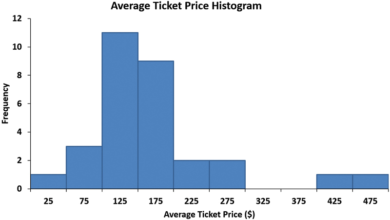
The following frequency and percentage distribution summarizes these data using 10 groupings from 0 to under 50 to 450 to under 500.
Average Ticket Cost |
Frequency |
Percentage |
|---|---|---|
0 to under 50 |
1 |
3.33% |
50 to under 100 |
3 |
10.00% |
100 to under 150 |
11 |
36.67% |
150 to under 200 |
9 |
30.00% |
200 to under 250 |
2 |
6.67% |
250 to under 300 |
2 |
6.67% |
300 to under 350 |
0 |
0% |
350 to under 400 |
0 |
0% |
400 to under 450 |
1 |
3.33% |
450 to under 500 |
1 |
3.33% |
|
30 |
100.00% |
Interpretation Frequency and percentage distributions enable you to quickly determine differences among the many groups of values. In this example, you can quickly see that most of the average ticket costs are between $100 and $300 and that very few average ticket costs are either below $50 or above $200.
You need to be careful in forming distribution groups because the ranges of the groups affect how you perceive the data. For example, had you grouped the average ticket costs into only two groups, below $150 and $150 and above, you would not be able to see any pattern in the data.
Histogram
Concept A special bar chart for grouped numerical data in which the groups are represented as individual bars on the horizontal X axis and the frequencies or percentages for each group are plotted on the vertical Y axis. In a histogram, in contrast to a bar chart of categorical data, no gaps exist between adjacent bars.
Example The following histogram presents the average ticket cost data of the preceding example. The value below each bar (25, 75, 125, 175, 225, 275, 325, 375, 425, and 475) is the midpoint—the approximate middle value for the group the bar represents. As with the frequency and percentage distributions, you can quickly see that very few average ticket prices are above $275.
Interpretation A histogram reveals the overall shape of the frequencies in the groups. A histogram is considered symmetric if each side of the chart is an approximate mirror image of the other side. The histogram of this example has more values in the lower portion than in the upper portion, so it is considered to be non-symmetric, or skewed.
The Time-Series Plot
Concept A chart in which each point represents the value of a numerical variable at a specific time. By convention, the X axis (the horizontal axis) always represents units of time, and the Y axis (the vertical axis) always represents units of the variable.
Example Consider the following data table, which presents the number of domestic movie releases from 1990 to 2020.
Movie Releases
Year |
Movies Released |
Year |
Movies Released |
|---|---|---|---|
1990 |
224 |
2006 |
608 |
1991 |
244 |
2007 |
631 |
1992 |
234 |
2008 |
607 |
1993 |
258 |
2009 |
520 |
1994 |
254 |
2010 |
538 |
1995 |
279 |
2011 |
601 |
1996 |
310 |
2012 |
669 |
1997 |
303 |
2013 |
687 |
1998 |
336 |
2014 |
708 |
1999 |
384 |
2015 |
708 |
2000 |
371 |
2016 |
737 |
2001 |
355 |
2017 |
740 |
2002 |
480 |
2018 |
873 |
2003 |
507 |
2019 |
792 |
2004 |
551 |
2020 |
200 |
2005 |
547 |
|
|
Source: Data extracted from “Domestic Yearly Box Office,” https://www.boxofficemojo.com/year/.
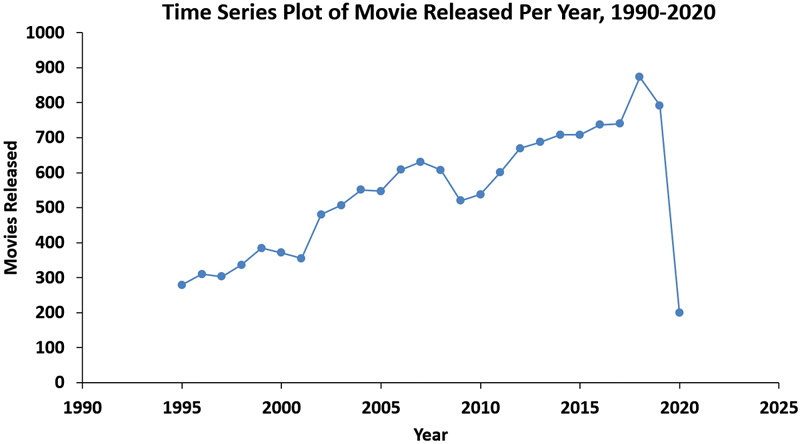
The following time-series plot visualizes these data.
Interpretation Time-series plots can reveal patterns over time—patterns that you might not see when looking at a long list of numerical values. In this example, the plot reveals that, overall, there was a general increase in the number of movies released between 1990 and 2019. Before the steep drop in 2020 caused by the COVID-19 pandemic, the number of movies released in the preceding 30 years had increased fourfold.
The Scatter Plot
Concept A chart that plots the values of two numerical variables for each observation. In a scatter plot, the X axis (the horizontal axis) always represents units of one variable, and the Y axis (the vertical axis) always represents units of the second variable.
ExampleConsider the following data table, which presents the average ticket cost (in U.S. $) and the premium ticket cost (in U.S. $) for each NBA team during a recent season.
NBA Ticket Cost
Team |
Average Ticket Cost |
Premium Ticket Cost |
|---|---|---|
Atlanta |
143 |
267 |
Boston |
234 |
448 |
Brooklyn |
212 |
391 |
Charlotte |
89 |
173 |
Chicago |
251 |
493 |
Cleveland |
135 |
268 |
Dallas |
124 |
245 |
Denver |
152 |
296 |
Detroit |
135 |
266 |
Golden State |
463 |
874 |
Houston |
177 |
346 |
Indiana |
130 |
252 |
L.A. Clippers |
137 |
271 |
L.A. Lakers |
444 |
857 |
Memphis |
104 |
203 |
Miami |
187 |
371 |
Milwaukee |
153 |
301 |
Minnesota |
107 |
204 |
New Orleans |
48 |
89 |
New York |
285 |
561 |
Oklahoma City |
199 |
390 |
Orlando |
127 |
249 |
Philadelphia |
197 |
383 |
Phoenix |
61 |
110 |
Portland |
119 |
233 |
Sacramento |
198 |
380 |
San Antonio |
195 |
384 |
Toronto |
180 |
338 |
Utah |
78 |
142 |
Washington |
138 |
271 |
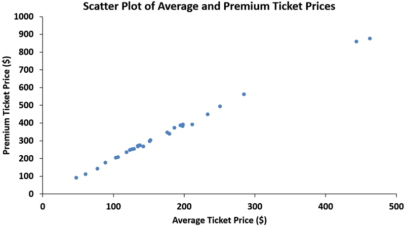
The following scatter plot visualizes these data.
Interpretation A scatter plot helps reveal patterns in the relationship between two numerical variables. The scatter plot for these data reveals a strong positive linear (straight-line) relationship between the average ticket cost and the cost of a premium ticket. Based on this relationship, you can conclude that the average ticket cost is a useful predictor of the premium ticket cost. (Chapter 10 more fully discusses using one numerical variable to predict the value of another numerical variable.)


