This chapter is from the book
This chapter is from the book
This chapter is from the book
Color
Color helps readers and viewers acquire and interpret information. Appropriate use of contrasting or complementary colors clarifies the structure and emphasis of a visual message. For example, if main headings are black and subheadings are blue, readers can easily grasp the organization of a document.
Color originates when an object emits or reflects different wavelengths of light. Light (as in a beam of sunlight) is made up of the colors of the spectrum. See Figure 1. Light shining through a prism bends to a different degree depending on its wavelength, thus revealing all the different colors in the spectrum.
)
Figure 1. Colors of the Spectrum Displayed With a Prism. As in this figure, the rainbow colors in a spectrum always appear in the same order.
Colors are categorized as primary or additive. Additive color starts with the light of three primary colors: red, green, and blue. Mixing light of these colors in equal amounts makes white light (imagine three overlapping colored spotlights in a darkened room). See Figure 2. Changing the mixture produces any color. For example, equal parts of red and green light make yellow light; red and blue make magenta; and green and blue make cyan.

Figure 2. Colors of the Spectrum Displayed by Mixing Primary Light Colors. Visualize multiple filters overlapping each other to produce different hues.
That is why color in a computer-generated graphic is designated by its RGB ratio (i.e., the ratio of red to green to blue). A graphic with an RGB ratio of 0-255-0 is pure green, where 0-255-255 is cyan. You can manipulate the RGB ratio with the color wheel or the custom color field in your software program.
Establish a color scheme and then add color standards to the project styles.
The styles for your document or presentation should include a color scheme, with text color(s), when or where they will be used, and background colors listed by topic, section, subject, or other logical grouping. For example, you might decide to use blue lettering for important rules and a light gray-shaded background for quoted passages. To predefine colors, you can choose the standard colors of your software program or select custom colors. Often you must use colors branded by your organization. The formula for these colors should be available as an RGB ratio. See PAGE LAYOUT for examples of styles. As you select colors, try to establish a color scheme that makes sense to potential readers. For example, if your readers are from the United States, green suggests prosperity (as in money), yellow suggests caution (as in a traffic signal), and red shows failure (as in red ink) or danger.
Color associations are not universal, so avoid assuming that a certain color always has a particular meaning. For example, in several Eastern countries, the color white is associated with death and mourning; in the West, white is traditionally a sign of purity and innocence.
Use contrasting, bright colors to show opposing concepts or major changes; use shades or tints of one color to show minor variations.
The color wheel in your software program is a basic diagram showing the relationships of colors, hues, shades, and tints, as well as complementary and harmonious relationships. A shade is a darkened hue—the decrease of light or the addition of black. A tint (the opposite of a shade) is a lightened hue—the increase of light or the addition of white.
The color wheel in Figure 3 shows the relationship between hues, tints, and shades.
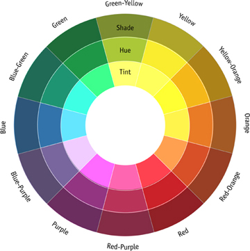
Figure 3. The Color Wheel. This schematic presentation shows which colors are complementary (opposite) of each other and which are only minor shades and tints.
Complementary colors are opposite one another on the color wheel. As the top row of Figure 4 shows, yellow and violet are complementary colors. Other complementary pairs are blue and orange, or red and green. As complementary colors, yellow and violet contrast sharply, as shown in the middle circle on the top row. Choosing a tint of yellow or a shade of violet produces less contrast, as in the third box on that row.
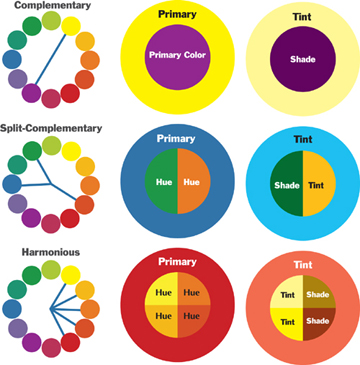
Figure 4. Complementary, Split-Complementary, and Harmonious Combinations. The left-hand column shows how these three combinations are defined. The middle and right-hand columns demonstrate different combinations as they would appear in graphics.
Graphic artists often choose complementary colors to create high contrasts. But this choice must depend on the purpose of each graphic. Some graphics—such as the advertising on a website—need to catch a buyer’s eye immediately, so high contrast is valuable. In other contexts—for instance, a high-definition computer projection—complementary colors are often too bright, maybe even annoying.
Split-complementary colors are two colors positioned adjacent to a single color on the wheel. Their complement is opposite their adjacent color on the wheel. As the second row in Figure 4 shows, red-orange is complementary to both blue and green. Split-complementary colors provide less contrast than complementary colors, but combinations of them are still bright, as the middle box on row 2 indicates. Using tints and shades decrease the contrast, as shown in the third box on row 2.
Harmonious colors lie between two primary colors on the color wheel. As Figure 4 shows, the harmonious colors between red and yellow clearly relate to each other; thus they provide less contrast than complementary combinations. Tints and shades will further decrease the low contrast between harmonious colors. Graphic artists use harmonious colors when they want to convey related ideas within a graphic or a document.
Match your color choices to your goal or purpose in designing a document or making a presentation.
Which color combinations should you choose? No set answers exist. Assess the purpose of your graphic and your text. If you need to communicate highly contrasting ideas or create a strong impact, choose complementary or split-complementary colors, as explained in rule 2 above. Conversely, if your message needs to be more subtle, then choose tints, shades, or even harmonious combinations.
Figure 5 shows one use of high-contrast colors. On road signs, the goal is to use colors so vividly that no one can miss seeing the sign.

Figure 5. Road Signs. Road signs use bright, contrasting color combinations for high visibility.
A more subtle use of color is desirable, however, in most business and technical documents and in graphics for business or technical presentations. Figure 6 shows how three business graphs would look with different color combinations. As in this figure, try printing sample graphics with different color combinations to judge what will be effective. Also, remember that the colors you see on a computer screen may not print accurately. You must often adjust colors to the parameters of the printer.
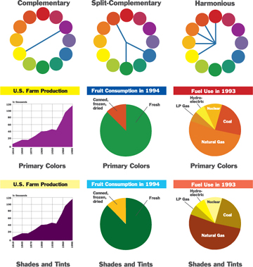
Figure 6. Color Combinations in Graphics. Color combinations in the second row are bright and might be distracting. The bottom row shows more subdued combinations using tints and shades.
If possible, test your color combinations by asking colleagues to review actual versions of your materials. Do they find the combinations to be appropriate, given the intended use of the materials? What changes would they suggest?
After some experimentation and after comments from colleagues, you will be ready to settle on a color scheme that works for a particular project. This is the color scheme you should include in your project style sheet (see rule 1 above).
Remember that color perception varies greatly among individuals.
Some combinations, such as orange-blue and red-green, appear to vibrate and disturb many readers. Although rare in women, red-green color blindness affects one in every 10 men. This combination is very difficult for color-blind men to interpret and should not be used. A red-blue combination does not provide enough contrast for a clear message. See GRAPHICS FOR PRESENTATIONS.
For more legibility, use a light background with dark text, and use colors sparingly.
Text in documents is usually printed in black ink on white paper because black ink generally costs less, so don’t make understanding your message dependent on text color.
But color is useful to separate sections or emphasize important points. Using colored paper is an inexpensive way to add color. For example, the USDA Forest Service manual, which contains rules governing Forest Service management activities, has traditionally used different colored papers for national, regional, and local sections of the manual.
Different combinations of text color and background vary widely in readability. Figure 7 on the next page shows some examples of colored text and backgrounds.
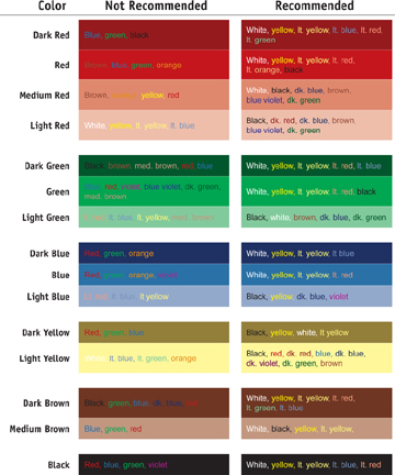
Figure 7. Colored Text on Different Colored Backgrounds. The recommended combinations (right column) still need to be verified in your particular context. Your printer or your paper may be just different enough to produce readability problems.
Remember that any of these examples may be less legible if you are using a computer projection or a video screen. Test the circumstances. Stand halfway back in the audience. A person in the back receives about one-fourth the image quality you see halfway back. See GRAPHICS FOR PRESENTATIONS.
In computer presentations, the high contrast of a dark background and light letters creates impact, but also a darker, more sober emotional effect.
Combine colors and textures to improve legibility and understanding.
Colors and textures can make almost any graphic easier to understand. But you must choose carefully to ensure that the viewer interprets textural elements as you intend.
Use similar colors to bring together elements in groups. Black-and-white patterns are almost as effective as color in grouping elements.
Be cautious in using textures, gradients, and embossing. The purpose of such elements is to help readers interpret information, but overuse can detract from your message and confuse readers. Avoid faddish use of these elements, such as swirls, vectors, splatters, or smoky effects.
Textures such as crosshatching, dots, or other shapes or lines should be used only when color is not available to distinguish between elements of a visual. Neighboring areas should not be too similar in texture.
Also, when selecting colors and tones or textures for graphs, consider how the finished graphic will photocopy. You may want to use both color and texture to create a pleasing color graphic while ensuring improved legibility of a photocopy. See also CHARTS, GRAPHICS FOR DOCUMENTS, GRAPHICS FOR PRESENTATIONS, GRAPHS, ILLUSTRATIONS, MAPS, and PAGE LAYOUT.
)
)
)
)
)
)