Dampening the Noise
Noise is data that is irrelevant to your decision. Noise makes it harder for you to understand what is going on because it makes it harder for you to hear or see what is happening. And noise is everywhere: in the data you collect and in the conversations you have with your internal stakeholders, customers, and teammates.
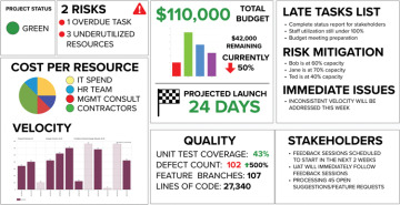
The dashboard in Figure 5.1 contains a lot of information and data, but most of it is noise. Many of these metrics may look great on a slide but are often not helpful when making decisions about a product.

FIGURE 5.1 An incredibly noisy project status report.
Here are a few common areas of focus we have seen on many status reports that add to the noise rather than dampen it:
Utilization: This refers to the resources (time, money, effort) used in relation to the resources available.1 Planning for 100 percent utilization is planning to fail. With people—not resources—assigned to multiple initiatives to maximize their utilization, managers get the illusion of efficiency at the cost of effectiveness.
Capacity: This defines a team’s or person’s availability and goes hand in hand with utilization. Just because everyone is busy does not mean your customer is happy.
Velocity: This represents the team’s previous capacity of a team. Velocity is not an indicator of performance or a predictor of the future. It represents the team’s previous capacity the team had to do work.
Productivity: This is often measured by the amount of output produced. Just because you are outputting a lot of things does not mean they fill a satisfaction gap.
Misguided quality metrics: In Chapter 3, “Becoming (More) Effective,” we discussed how a team can become more effective. Dashboards often include things like code coverage, feature branches, and lines of code (see Figure 5.1) that are irrelevant to a team’s ability to innovate (A2I).
Budget: Because we cannot print money, we are constrained in some way by a budget. Being completely budget-driven can limit the available options and create pressure to make decisions prioritizing cost over quality. Lower quality brings on the noisy long-term consequences of bugs, dissatisfied customers, and a difficult product to support and enhance.
Time: We have watched a lot of organizations focus so much attention on dates that they forget why they are building what they are. The timeline becomes the condition of success.
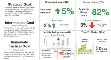
What if there were a simpler way to approach a dashboard? A dashboard should be used to invoke conversations about signals. Figure 5.2 shows an example of an evidence-based management (EBM) dashboard illustrating relevant information rather than noise.

FIGURE 5.2 A dashboard that provides more useful information.
The dashboard represented in Figure 5.2 helps us invoke important discussions to help you answer the following questions:
What is the strategic goal we are working toward?
What is the intermediate goal we are focusing on?
What is the immediate tactical goal we are working to achieve?
What are some things we can measure to know if we are on a path to these goals or if these goals are still relevant?
A more simplistic, goal-focused dashboard changes the dynamic of your conversations, helping you to dampen the noise and have new and better conversations. Dashboards can, should, and will change depending on the point in time and audience. Dashboards should never be stagnant.
