Navigating the Tableau Interface
Now that you have connected to some data in Tableau, you can click the prompt to Go To Worksheet and start getting to know the Tableau user interface (UI) in a more meaningful way. Like the Data Source page, the Tableau UI is a drag-and-drop interface that fosters rich interactivity between sheets, dashboards, and stories, allowing for in-depth visual exploration and powerful visual communication. Tableau is similar to Excel in that its files are called workbooks and the sheets inside the workbook are called sheets. Every Tableau workbook contains three elements:
Sheets: For creating individual visualizations. Each workbook can contain multiple sheets—one for each data visualization you create.
Dashboards: For combining multiple sheets as well as other objects like images, text, and web pages, and adding interactions between them like filtering and highlighting. Dashboards are great for looking at the interactions between multiple visualizations in a single view.
Stories: These frameworks can be based on visualizations or dashboards, or they can be based on different views and explorations of a single visualization, seen at different stages, with different marks filtered and annotations added. However, stories are best suited to narrate the story in your data.
We’ll cover dashboards and stories, and the differences between them, in more depth in later chapters. For now, let’s focus on sheets and take a high-level view of the various areas of the Tableau worksheet canvas. As we begin to work directly with data to perform visual analytics and build visualizations, dashboards, and stories throughout this book, we’ll explore these areas—and more—in detail through hands-on exercises. For now, this high-level overview is intended to orient you to the various aspects of the user interface.
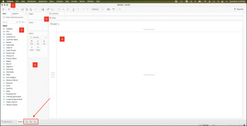
As shown in Figure 3.14, the Tableau interface includes five basic elements:
Menus and toolbar
Data pane
Shelves and cards
The canvas workspace
Legends

Figure 3.14 The Tableau user interface, a blank canvas.
Menus and Toolbar
Even though most of your Tableau work can be accomplished by interacting directly with the drag-and-drop canvas, the menu bar that launches with the software includes various menus that provide access to additional features and settings. This includes the File and Data menus, as well as the Worksheet, Dashboard, and Story menus, each of which contains specific controls for those canvas types. Additional menus, such as the Analysis, Map, Format, Server, Windows, and Help menus, contain even more functionality and controls.
At the top of the Tableau sheet is the toolbar, which is similar in concept to the ribbon in Microsoft Office products. The toolbar contains many powerful buttons that give you control over your Tableau experience and enable you to navigate from the data source all the way to story presentation mode. A few items of special note are highlighted here:
Logo: The Tableau logo button brings you back to the original Connect to Data screen (clicking the icon from this screen returns you to your sheet).
Undo: There is no limit to how much you can undo in Tableau, which is an important feature for exploration and discovery. The icon is grayed out until there is an action to undo.
Save: There is no automatic save in Tableau. Be sure to save your work incrementally.
Another menu appears along the bottom of the sheet. This menu, similar in concept to a Tableau workbook, enables you to return to the Data Source screen; create new sheets, dashboards, or stories; and do things like rename, rearrange, duplicate, delete various sheets, and so on.
Data Pane
The pane on the left of the sheet is called the Data pane. It has two tabs: a Data tab and an Analytics tab.
Data
At the top of the Data tab is a list of all open data connections and the fields from that data source categorized as either dimensions or measures (discussed shortly).
Analytics
The Analytics tab enables you to bring out pieces of your analysis—summaries, models, and more—as drag-and-drop elements. We will review these functions later.
Shelves and Cards
Shelves and cards are some of the most dynamic and useful features of the Tableau UI.
Columns and Rows shelves: Control grouping headers (dimensions) and axes (measures).
Pages shelf: Lets you break a view into a series of pages so you can better analyze how a specific field affects the rest of the data.
Filters shelf: Filters visualizations by dimensions or measures.
Marks card: Controls the visual characteristics of a visualization, including encoding of color, size, labels, tooltip text, and shape.
“Show Me” card (shown closed): A collapsible card that shows application visualization types for a selected measure and dimension.
Legends
Legends will be created and automatically appear when you place a field on the Color, Size, or Shape card. To change the order (or appearance) of fields in a visualization, drag them around in the legend. Hide legends by clicking on the menu and selecting Hide Card. Likewise, bring them back by selecting the Legend option on the appropriate space in the Marks card or by using the Analysis menu.
