This chapter is from the book
This chapter is from the book
This chapter is from the book
The Power of Stories
We’ve established that data stories are powerful, and that they are powerful because of their ability to communicate information, generate understanding and knowledge, and stick in our brains. However, as information assets, visual data stories have a few other noteworthy qualities.
But first, let’s set the record straight. There is much to be said about how visual data stories creating meaning in a time of digital data deluge, but it would be careless to relegate data storytelling to the role of “a fun new way to talk about data.” In fact, it has radically changed the way we talk about data (though certainly not invented the concept). The traditional charts and graphs we’ve always used to represent data are still helpful because they help us to better visually organize and understand information. They’ve just become a little static. With today’s technology, fueled by today’s innovation, we’ve moved beyond the mentality of gathering, analyzing, and reporting data to collecting, exploring, and sharing information—rather than simply rendering data visually we are focused on using these mechanisms to engage, communicate, inspire, and make data memorable. No longer resigned to the tasks of beautifying reports or dashboards, data visualizations are lifting out of paper, coming out of the screen, and moving into our hearts, minds, and emotions. The ability to stir emotion is the secret ingredient of visual data storytelling, and what sets it apart from the aforementioned static visual data renderings.
As we’ll explore in later chapters, emotional appeal isn’t enough to complete a meaningful visual data story. Like any good tale, a data story requires an anchor, or a goal—be it a reveal, a call to action, or an underlying message—to pass to its audience. This idea isn’t unique to data storytelling by any means, but a construct applied to all varieties of stories. When a story imprints on our memory, it requires emotion plus a willingness to act on that emotion.
Instead of talking about the power of visual data stories, let’s see them in action. As we do, we’ll be looking for the following key takeaways:
Sometimes the only way to see the story in data is visually.
A good story should meet its goals—and it should be actionable.
A story should change, challenge, or confirm the way you think.
Storytelling evolves—don’t be afraid to try something new.
The Classic Visualization Example
One of the core tenants of a visual data story is that it uses different forms of data visualization—charts, graphs, infographics, and so on—to bring data to life. Perhaps one of the most archetypal examples of the power of data visualization to help people see and understand data in ways they never would by looking at rows and columns of raw black and white data comes from Anscombe’s Quartet (see Figure 2.3). Constructed in 1973 by statistician Francis Anscombe, these four datasets appear identical when compared by their summary statistics. If you review the table, you will notice that each dataset has the same mean of both X and Y, the same standard deviation, the same correlation, and the same linear regression equation.
)
Figure 2.3 Four seemingly identical datasets known as Anscombe’s Quartet.
Even though the individual variables are different, if the statistical outputs are the same, we would expect these, when graphed, to look the same. The “story” for each of these datasets should be the same—right? Wrong.
When graphed (see Figure 2.4), we can see beyond the limitations of basic statistical properties for describing data, and can tell a bigger picture of the datasets and the relationships therein.
Anscombe’s example might be classic in terms of putting some support behind visual horsepower, but it only brushes the tip of the iceberg in terms of visual data storytelling. Although we might not yet have everything we need to tell a story, we can start to see that the sets are not so similar as they might appear, and there is something worth talking about in these datasets. We know there is a story there, and we know we need to visualize it to see it, but we are still left wanting. This isn’t quite a visual data story, but it’s definitely a first step.
)
Figure 2.4 Anscombe’s Quartet, visualized.
Using Small Personal Data for Big Stories
When it comes to telling a story, no one knows how to do it better than Hollywood—except maybe networks like Netflix and AMC that are using massive amounts of consumer-generated data as recipes to create new content.
Graphic designer Chelsea Carlson decided to take this approach to a personal level. In a 2016 experiment, Chelsea focused on analyzing her personal Netflix viewing habits to see what story her own data might tell about her television binging habits, tastes and preferences, and—perhaps more important in a streaming TV market saturated with more new shows every day—possibly even help her predict a new favorite by telling her exactly what to look for (this, by the way, is not too unlike how Netflix is using its user viewing data to curate new shows).
Like many analysts, Chelsea began her experiment by collecting and organizing her Netflix viewing data in spreadsheets organized in Microsoft Excel. She tracked several variables on her top 27 favorite shows, including things like genre, language, main character gender, episode length, IMDB rating, and more (see Figure 2.5). As a tool, a color-coded spreadsheet helped Chelsea get a bird’s eye view of some of the interesting patterns and trends in her data (like whether she seemed to prefer multi-season shows or if her favor aligned with award winners) as well as areas where her tastes were less predictable (no preference for age and race of the lead character or the show’s setting or length). However, this was the extent of meaningful analysis that Chelsea could achieve when limited to scouring rows and columns of information—even colored ones (see the upcoming sidebar “Color Cues”).
Like Anscombe’s Quartet, when Chelsea plotted her data it transformed beyond its meager Excel boundaries and moved into the realm of visual storytelling, this time showing a much richer tale (see Figure 2.6).
)
Figure 2.5 Chelsea Carson’s Netflix data spreadsheet, in table form.
)
Figure 2.6 Chelsea Carlson’s Netflix data visualized.
As a visual storyteller, Chelsea worked through visual discovery and a variety of graph types that included scatter plots, packed bubble charts, timelines, and even pie charts to build her data story. She also integrated expressive visual elements—particularly size and color—to provide visual cues to assign meaning to the visualization and highlight certain insights. As a result, Chelsea was able to come away with a rich visual data story encapsulated within a series of very deliberately crafted visualizations. There are several interesting story points to pick out within this visualization—including a strong bias for costume dramas and shows cut short—and you can explore them for yourself in the URL included. However, perhaps the most salient point is that through this story Chelsea can take action on the goals she set for this visual story. She can clearly see her tastes and preferences, and when she goes scrolling through Netflix for her next binge-worthy show, she’ll know to look for a female-led costume drama with a genre-bending storyline.
COLOR CUES
The Netflix experiment brings to mind an important learning point in the power of data visualization. One of the most important lessons in learning how to build data visualization is learning how to leverage what are referred to as pre-attentive features—a limited set of visual properties that are detected very rapidly (around 200 to 250 milliseconds) and accurately by our visual system, and are not constrained by display size. A good visualization—the building blocks of a visual data story—reduces time to insight and leverages our brain’s pre-attentive features to shave time as low as possible.
Let’s take a look at the pre-attentive feature known as perceptual pop-out. Perceptual pop-out is the use of color as a beacon to pre-attentively detect items of importance within visualization. The shape, size, or color of the item here is less important than its ability to “pop out” of a display. Further, these should be used sparingly, and with intention. Too many of these features at once negates their impact, or—worse—can have a detrimental effect on your visual.
Consider a visit to the eye doctor, when your vision is tested by the ability to spot a flash of color in a sea of darkness, or take a look at Figure 2.7.
)
Figure 2.7 A table showing companies with respective annual gross profits, 2013–2016.
*All data gathered from www.amigobulls.com
This is a simple table with only three companies, but suppose I asked you to tell me, in each year, which company had the highest gross profit? You are tasked with analyzing each box of the table, line by line, to assess each year independently and select the highest number. You might even have to write it down or mark it in some way to help you remember the winner. Go ahead and give it a try. It should take you roughly one minute to complete the exercise.
Now, take a look at Figure 2.8 and try again.
)
Figure 2.8 A table showing companies with respective annual gross profits, replaced by color, 2013–2016.
This time, we’ve replaced the numerical data with a visual cue. Rather than reading the table, perceptual pop-out makes completing this exercise near instant. We don’t have to actually “look” for answers; we simply “see” them instead.
Because the sample we are looking at is so small, this is a good time to remark on the special partnership between color and counting. Essentially, the fewer things there are to count, the quicker we can count them—which makes sense. If I asked you which company outperformed the others, Disney would be an easy response as it has three out of four of the orange squares.
Our ability to “count” visually is called numerosity. It is a numerical intuition pattern that allows us to see an amount without actually counting it, and it varies among individuals although the typical counting amount ranges between two and ten items.
As you build visualizations as part of your storyboard framework, be sure to pay careful attention to color and counting to help your audience easily and intuitively experience your story.
The Two-or-Four Season Debate
In school, we’re taught that a full year includes four distinct seasons—spring, summer, fall, and winter. Yet, some people argue that only two true seasons exist—summer and winter—and they’re using a form of visual data storytelling (and a good heaping of rationality) to prove their point. My favorite of these comes from artificial intelligence researcher Nate Soares’ blog, Minding Our Way.2
The item up for debate in this story is a simple one: Is it fair to qualify “waxing summer” (also known as spring) and “waning summer”” (also known as autumn) as full seasons? Sure, it’s familiar and if you live in the northern hemisphere you can likely distinguish the seasons according to their observable natural phenomena—such as their colorful transitions—flowers blooming or leaves changing color—rather than their actual astronomical dates (and this doesn’t even begin to open the conversation on astronomical versus meteorological dates of change3).
Let’s begin to build a story around this and see where we end up. First let’s agree on a foundation: The year follows a seasonal cycle that starts cold and gets progressively warmer until it peaks and begins to cool again. Repeat. Right? This is a pretty basic assumption. More importantly, it’s one that we can successfully chart—loosely and without requiring any more specific data or numbers at all. Rather, we’ll use points from the basic story premise we laid out earlier to graph a seasonal continuum for the year, using length of daylight as our curve (see Figure 2.9). From there, we can try to decide just how many seasons are really in a year.
)
Figure 2.9 The seasonal cycle of a single year.
How many curves does the orange line trace? The answer, obviously, is two—hence the two-season viewpoint (see Figure 2.10).
)
Figure 2.10 Two seasons.
Now, we could break this down further with more information. We could add in astronomical dates or mull over geographic differences in weather or meteorology. However, whether or not you agree with Nate and me (and others!) on the number of qualifying seasons that occur over the course of one year, the preceding two graphs represent a powerful data story—and they don’t even require the type of “hard data” (rows and columns of numbers) that we would typically expect. This shows us—quite literally—that to tell a great story doesn’t necessarily require a ton of data. It just requires a few points, a goal, and the creativity to visualize it for your audience in a way that affects their opinion.
Napoleon’s March
As I’ve mentioned, using visualizations to tell stories about data is not a new technique. French civil engineer Charles Joseph Minard has been credited for several significant contributions in the field of information graphics, among them his very unique visualizations of two military campaigns—Hannibal’s march from Spain to Italy some 2,200 years ago and Napoleon’s invasion of Russia in 1812. Both of these visualizations were published in 1869 when Minard was a spry 88 years old.
Minard’s flow map of Napoleon’s invasion of Russia (see Figure 2.11)—unofficially titled “Napoleon’s March by Minard”—tells the story of Napoleon’s army, particularly its size (by headcount) as it made its way from France to Russia and home again. As you read this visualization, moving left to right, the beige ribbon thins, signaling the waning of Napoleon’s army from 422,000 to 100,000 as they marched east, during the winter, to Moscow. The army turned around and retreated, returning to France with a mere 10,000 men. We can move through the visualization, imagining the soldiers’ journey and peril as they hiked through increasingly inhospitable and unfamiliar territory, turning around and coming home, losing more than 400,000 comrades on the way to war, cold, and disease.
)
Figure 2.11 Napoleon’s 1812 March by Minard, 1869.
Obviously, this was not a successful war, and as an analysis piece Minard’s map is not a successful one analytically. However, as a visual story around human drama, it has earned the distinction of becoming known as one of the best storytelling examples in history. You would be hard pressed to take a data visualization class today and not experience Napoleon’s march. It’s fair to note, too, that several analysts have tried to recreate it, using more common statistical methods but all fall short of the original’s storytelling appeal.
Minard’s second military visualization, Hannibal’s journey through the Alps (not pictured), is similar in concept to Napoleon’s march, although it didn’t quite pull off the same memorable story. Most stories have an inherent amount of entropy—we need to tell them quickly and succinctly, and many times this means we only get one chance. In fact, numerous examples of this “once and done” effect exist in more modern visual data stories, too. These one-hit wonders are an expected consequence of good stories. Sometimes we only need to tell them once—no sequels necessary.
Stories Outside of the Box
Thus far we’ve looked at some of the most classic examples of visual data stories to those more modern. We’ve even looked at visual data storytelling without data in the classic sense. Now, let’s finish our tour of the power of visual data storytelling with one of the most quintessential instances on the books: Nigel Holmes’ “Monstrous Costs” (see Figure 2.12).
)
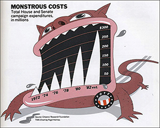
Figure 2.12 Nigel Holmes’ Monstrous Costs.
This hand-drawn illustration does exactly what a visual data story is supposed to do: It transforms boring data into something alive. At its core, this data visualization is little more than a bar chart that shows rising costs on political campaign expenditures, but it’s the storytelling detail that gives it the flair that has made it such a powerful example. It weaves a story around the data, anthropomorphizing these costs from dollars and cents to a ravenous beast, replete with jagged teeth and flying spittle. As with the Napoleon’s March by Minard graph, we’ll take a much closer and more critical look at this story in a later chapter, but for now the lesson is simply that visual stories come in all shapes and sizes, some more technical looking and some so unique and personalized that they are barely recognizable as visualizations.
What masterful storytellers can do is to straddle that balance, and capitalize on the best features to tell their story. In Monstrous Costs, these features allow the image to hook into memory, clearly telling the story of rising campaign costs with the intended emotion of the storyteller.